During the 2020 lockdown, many social media and website developers realized that their platforms did not accommodate visually impaired users very well, which led to a surplus of new accessibility features being added to these sites. If you would like to know more about how to accommodate blind and low vision readers, here are a few steps that you can implement on your various social platforms.
1. Learn About Screen Readers
A screen reader is a type of software that gives audible descriptions of computer content. There are various downloadable screen reader programs, including Job Access With Speech (JAWS) for desktop, VoiceOver for iOS, and TalkBack for Android. When choosing where you show up on social, it can be helpful to think about which platforms are compatible with this type of software. For example, Instagram and Facebook are compatible with JAWS, VoiceOver, and TalkBack and feature a form allowing users to report any issues with assistive technology.
2. Add Alt Text
If you are a frequent user of Instagram, Facebook, or Twitter, you may have noticed a small button labeled “ALT” in the corner of some photos, gifs, and short videos. Alt text makes visual media accessible for users of screen reading software by giving short text descriptions of what is being depicted. Many social media platforms have implemented alt text as a feature that can be added to posts; it can also be included at the end of a photo caption.
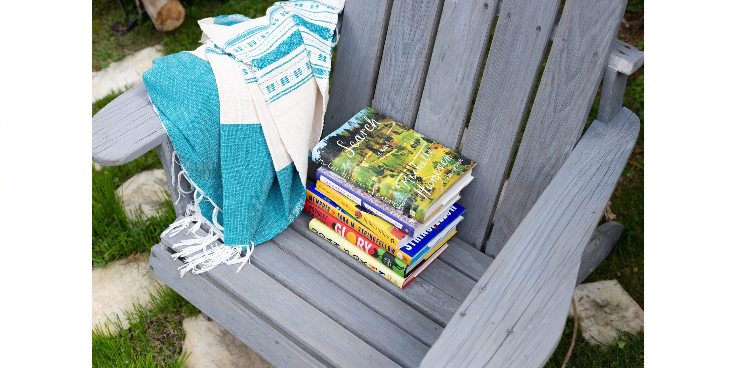
When writing alt text, it is important to make sure that your descriptions are succinct but thorough. One sentence should describe the focus of the image. For example, a good alt text blurb for the image above would be “A stack of books rests on a lawn chair.”
3. Color Contrast Is Key
For users with color sensitivity or low vision, contrast is a hugely important factor in their ability to access a webpage. Some social media platforms, like Pinterest, have made color contrast sensitivity improvements to ensure pages are legible. If you run your own blog or newsletter, there are a few ways you can do this too. Remember that content needs to be clearly distinguishable from the background. Avoid colors that are similar in tone or hue. Ensure that links are well-defined against the regular text by making them bold, underlining them, or making them a contrasting color from the text and background. You should also avoid red and green text for those with red-green color blindness. To learn more about color contrast accessibility, check out this resource from the Web Accessibility Initiative.
4. Enhance Your Captions
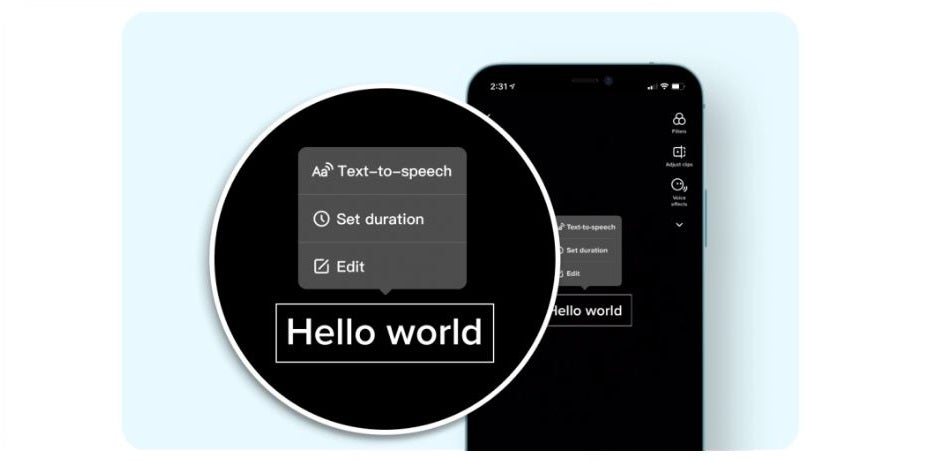
Most video hosting websites feature captions, and there are a variety of ways to enhance them. Automated captions are available on sites like YouTube, Twitter, Facebook, Instagram, and TikTok, but all of them allow you to edit the captions on your posts for accuracy. On Instagram, you can change the color of captions to ensure their legibility. Twitter users can upload caption files along with videos. TikTok also includes text-to-speech as one of their video editing features.
Credit: TikTok
5. Test Your Accessibility with a Tool
There are a variety of resources for internet accessibility, especially if you are constructing your own website. Take advantage of software that can run through the page and ensure that everything is as seamless as possible. A great beginner tool is WAVE (Web Accessibility Evaluation Tool). Simply paste your website URL into the tool and it will give you some basic feedback, including text contrast errors or missing alt text.
This list is far from comprehensive, as there are many ways that social media and blog content can be optimized for consumption by visually impaired users. The best place to start is with awareness. If you are a beginner, explore the accessibility settings on the social media platforms you already use. To go deeper and/or if you are more tech savvy, feel free to scan the Web Content Accessibility Guidelines and see how well your website complies. Some social media platforms also have dedicated blogs to illuminate their accessibility features and provide great guidance. Remember, even the smallest effort to accommodate everyone can greatly improve your connection with every one of your readers.
Jacky Bethea is the Associate, Author Development for Penguin Random House.


