Nearly all books are still made of ink on paper, whether printed on a conventional offset press or the more recent digital presses. To paraphrase Gertrude Stein: a book is still a book is still a book. But for each title we publish, the process of getting the book to press differs greatly. Read on to learn more about the interior design and print production processes at Knopf Doubleday Publishing Group.
At Knopf Doubleday, and throughout most of the book publishing industry, methods for the production of books have never been more flexible and varied than they are today. Also, each title has its own unique requirements, which makes print production an exciting and ever-changing endeavor.
Preparing the Manuscript
Today, most of the manuscript preparation process is performed using digital tools, like electronic copyediting, determining the structural elements in an author’s Word file, and assigning style tags to those elements in the manuscript. These procedures ensure adherence to the author’s and editor’s intentions (you can learn more about these processes by watching this video).
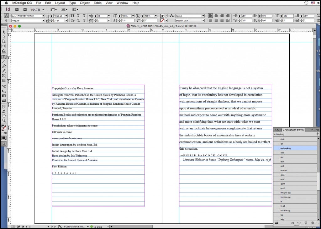
After the manuscript file is carefully prepared by a production editor, the production manager will convert the structured Word file into the file format that the interior designer will use to create style attributes when laying out the book in InDesign.
Mapping out the Book’s Interior Design
Once the text is copyedited, the author has agreed to the changes, and those edits have been incorporated into the manuscript, the file gets passed along to the interior designer. The interior design team’s job is to ensure the text is as legible and inviting to read as possible, while making the book fit within previously defined parameters, such as format, trim size, and page count.
Designers also review any art or photographs the author has supplied for the book, to ensure that the quality meets printing standards and to determine the size and placement on the page, based on the author’s or editor’s indications. Photos may be placed throughout the text or grouped together in photo inserts (sections that are printed on paper better suited for photographic reproduction). The designer may hire illustrators or mapmakers, if needed, and will direct their work, coordinating the author’s input, aesthetic considerations, and proofreading changes.
Making Design Choices
Interior designers usually start by reading the manuscript to determine how best to organize the material and represent the subject matter. They may also look at previous books an author has written or go to authors’ websites, if they have them, to get an idea of their sensibility. Publishers and editors may also have in mind a particular look they want for each book. Occasionally, authors express strong preferences about the design of their book as well.
Designers choose fonts suitable for the subject matter, taking into account, for instance, the time period a book takes place in, whether the book is fiction or nonfiction, whether the content of the book is literary, commercial, scholarly, and so on. Often one typeface will be used for the text and another for the display (the larger type used for chapter titles, title pages, and other headings). The font used for the text must, above all, be legible, but display type can be more decorative and distinctive, and is often used to convey the feel of a book.
Flexibility and Unusual Designs
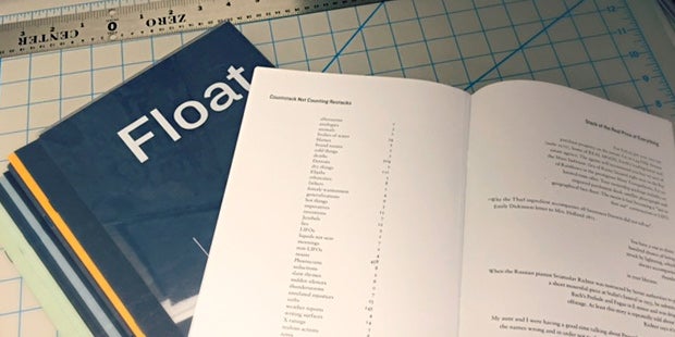
Each book will end up with a design that fulfills the intent of the manuscript. But in some cases, unusual elements of a book add exciting challenges for the interior design team. Knopf Doubleday recently designed the poetry collection Float, by Anne Carson. It comprises twenty-three individual booklets with colored covers, each containing a poem or prose poem, that are collated into a transparent acrylic slipcase. The poems and other pieces in the booklets have different or quirky formats and are of varying lengths.
The author wanted the reader to be able to pull out a section and return it to the slipcase in any order, thus adding a level of serendipity to the reading experience. The booklets can be read in any sequence and shuffled within the box; the reader will see the cover of whichever booklet is on top through the clear slipcase. Through close collaboration with the author, the interior designer and production manager were able to meet this unusual but exciting challenge. (Note: this final package design followed several other proposed iterations to achieve the author’s goals.)
Digital Trends in Interior Design
In the past, the book design process was manual and much more laborious, but the use of tagging to apply styles to the entire manuscript from the start has made the process faster and more efficient. This allows the designer to quickly see how their design will function throughout the book and to determine cast-off, or page count, early in the schedule, which is a critical step in determining what the physical book will be.
Production Windows and Faster Timelines
Sometimes a book is rerouted to the fast lane for one of many reasons: to coincide with holidays, national and global events, or special anniversaries, to name a few. When this happens, our production window becomes much shorter.
For Gratitude by Oliver Sacks, we worked quickly with the author’s estate to publish Sacks’s New York Times op eds in book form as a memorial volume. This sixty-four-page hardcover with gift book specifications, including a full-cloth case, required the finesse of conventional offset printing and high-quality paper for the highest production values, but was designed and produced in just a few short weeks to be ready in time for end-of-year holiday sales.
Design specifications and production timelines vary from book to book, so the process of preparing the book for print is uniquely tailored to fit each manuscript, heightening the reader’s experience with the book.
Andy Hughes is Senior VP & Director of Production & Design for Knopf Doubleday Publishing Group.
Cassandra Pappas is Senior Designer for Knopf Doubleday Publishing Group.


