
For many authors, the design process behind their book jackets remains a mystery. Read on for a PRH creative director’s firsthand experience of creating cover designs, insights into how to translate a manuscript into a visual concept, and examples of different cover options for a few of our titles!
As creative directors, designers, and illustrators, how do we create book covers that exemplify the story inside? How many versions of the cover do we create? Where do we get our inspiration? Who weighs in?
The answers vary a bit from imprint to imprint but for the majority of the titles I work on, the process is quite similar. Each imprint has a weekly cover or packaging meeting, where we concept new titles, show what we call “comps”—covers for other similar books—and discuss cover effects. The meeting might be attended by ten to thirty people from the marketing, publicity, editorial, and art departments.
We first hear about a new title from the editor, who tells us briefly about the book—or gives us its elevator pitch. If it’s fiction, we discuss the plot and genre. Nonfiction is a little different, but we still need to know who the audience is and what the book is about. Editors usually prepare what’s called a “tip sheet” and let us know if the manuscript is available to read. If the author is established, the editor will bring their previous book covers for us to review. If it’s a new author or one writing in a new genre, we ask them to bring comp titles. We usually ask about the target market or audience we are trying to reach and if the editor or author has any ideas or preferences for the cover. This might include other covers they like, photographs, illustrations—really anything to give us a sense of their style. Some authors and editors create a Pinterest mood board; others provide us with a brief one-page proposal of issues to keep in mind for the cover design. We then lean on marketing and publicity to tell us what’s working in the marketplace.
Someone in my group who is passionate about a book is usually going to produce the best cover for us. Sometimes, I read the book first or give it to one of my art directors who I feel would be the best fit. We then meet informally to discuss the ideal approach. We decide if we want to create the cover in-house, or if we should hire a freelance illustrator, photographer, hand letterer, or designer.
Every designer’s process is different and will vary from project to project. But it all starts with a good concept. At this stage of design, we brainstorm different ideas and start researching art, photography, or illustration styles based on the book’s feel, while keeping the comp titles in mind. We then create sketches or mood boards to help us visualize the final cover.
If I am stuck creatively, I usually look at design or book websites or head to Instagram for inspiration. I also frequently visit both independent and chain bookstores to watch what people are picking up and what the current trends are. (If you’re shopping in a bookstore, I may stop you and ask if you like the cover. Don’t be alarmed—I’m just doing my own market research!) My job is getting someone to pick up the book—while capturing the author’s voice, finding the target market, and creating a visually fresh, creative cover that withstands time.
When the cover comps are ready we present them to the team. In the last few years, we’ve switched from showing physical comps to showing them onscreen. We show the same design twice—once as a large cover and then at thumbnail size to replicate what consumers see at first glance on their mobile phone or when shopping online. The number of comps we present ranges from title to title, but I think the sweet spot is anywhere from four to ten different concepts. This can be the proudest and most stressful part of being a designer: when a large group sees your work for the first time and begins to critique it. I don’t like to explain what is on the cover or what they are looking at—if I need to explain the design to the publishing team, then the consumer will likely miss the idea as well.
Sometimes the winner is instantly clear and unanimously decided; other times the room is split and people like different covers for different reasons. A lot of times there may be specific feedback along the lines of “I love the art, but prefer the type in comp 3,” or “I like the concept, but not the overall color,” or something simple like “The author’s type on their last book was blue, and I wish this could be red.” And sometimes we may have totally missed the mark and they don’t feel like any of the approaches are right for this book.
After the meeting, I meet with my team to discuss the feedback and begin to work on revisions. If simple tweaks are needed, we email them around, but if we are starting fresh and the cover is a total redo, then we’ll prepare new comps for next week’s meeting. And this process continues until everyone loves the cover. Finally, it is sent to the author and agent.
After we get the author’s and agent’s approval, we share the cover with the sales team at our strategy and sales conference meetings. This is a much larger group with fresh eyes and maybe some different insights. I look for the same comments and reactions as I do at the cover meetings: Did we hit the right mark? Does everyone feel this will sell? Will the buyers like this approach for this kind of book? Sometimes after this meeting we have to make additional tweaks to the art, design, or copy; sometimes we have to start all over yet again.
In the end, I really want the impossible: for everyone to love the package we did for each and every book. I know art is subjective and it is at times difficult to please everyone, but we do try!
For your visual pleasure, here are a few examples of covers we created that were a lot of fun to work on and that had many iterations before the final product was chosen.
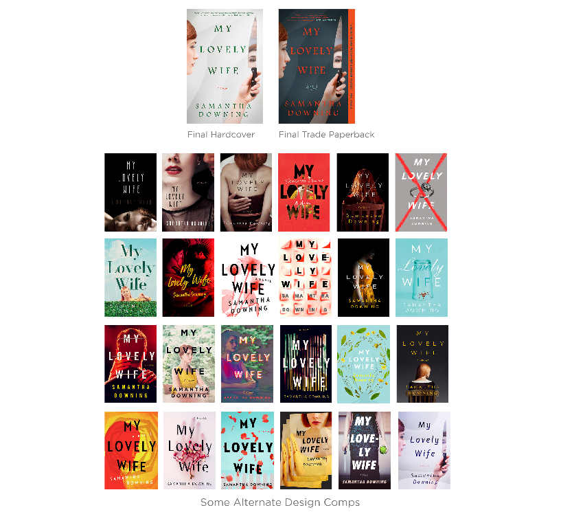
My Lovely Wife: Described as a bonkers or antic thriller, Dexter meets Mr. & Mrs. Smith. It was a different kind of book and our publisher challenged us to come up with a commercial look that would appeal to fans of Netflix’s You or the movie A Simple Plan. Here are several alternative designs we presented.

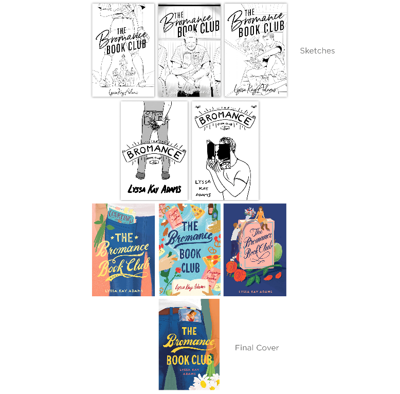
The Bromance Book Club: A new rom com about a baseball player who joins a secret men’s book club that helps save his marriage with Regency romance novels. Here are some different iterations, from early sketches to more complete concepts.

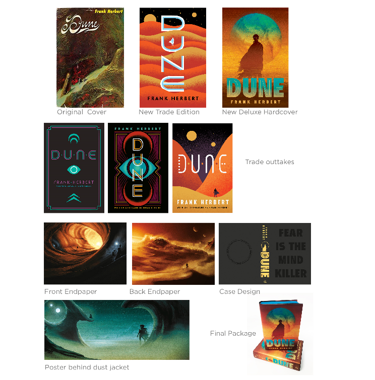
Dune: It’s always fun to work on classics where everyone knows the book and we can explore different approaches. Here are the trade repackage and deluxe hardcover editions.

Anthony Ramondo is SVP and Executive Creative Director, Penguin Publishing Group at Penguin Random House.