A great book cover should be striking, memorable, profound, and, most of all, eye-catching. It should pull a reader across a bookstore with a flash of color or a slick effect. But today, designers must think beyond the physical bookstore and consider the digital one as well.
The parameters of each differ in nearly every respect—so how have designers adjusted? With the huge growth in online sales, has the digital bookstore begun to drive the design process?
We spoke with some Penguin Random House experts on cover design and selling online to learn more.
The Sizing Challenge
The most noticeable difference between a cover’s presentation online and in person is its size. On the shelf, a cover might be 10″x6″, but online it shrinks to about an inch on a computer screen—and even smaller on a mobile device. Given this discrepancy, you might think that the solution to this conundrum would be creating two different covers—one that works on a larger scale and one that pops at a fraction of that size. But designers warn against this. The cover is the most obvious consumer-facing branding of a book, and designers want to ensure that a reader can recognize that brand across all formats and platforms. Whether a reader sees the cover in a promotional email recommending the book, in the window as she passes her local bookstore, or online when she goes to buy it, she should see the same image every time. The consistency bolsters her relationship with the book and increases the likelihood of purchase.
Also, cover designers have adopted principles of “adaptive design.” They test their designs by shrinking and enlarging them to confirm that the concept works at any size. “If a cover is good,” says Peter Mendelsund, Knopf Doubleday Group art director, “if it’s balanced and works, it should work in all sizes.”
Subtle Adaptations
A cover should appeal to its target audience in terms of both taste and format. If 75 percent of a book’s sales are in print, even if 60 percent of those purchases occur online, the best possible cover for that title is one that works well in print. If that same cover doesn’t work as well as a digital image, designers find ways to gently tweak the digital image so that the reader sees the best possible representation of the physical product.
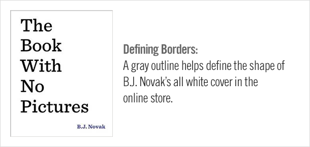
A white cover, for example, might be striking in the physical format, but nearly invisible online, where it floats in space on a white background. Another cover might use texture instead of color to create contrast (single-color raised text, for example), which can render the resulting digital image blurry or illegible. A creative designer finds ways to alter these images slightly so that the digital version has the same effect as the physical one. For a white cover, the designer might add a gray border to define its shape, and to better express single-color raised text, she might increase the color contrast so the text stands out clearly.

The Power of Search
Two other popular cover features that may not translate are author or reviewer quotations and “bursts” that advertise award-winner status or special offers. At a reduced size, these features are impossible to read and look like mere smudges. As Scott Shannon, SVP, publisher, digital content, Random House, points out, “In an online store, a burst or a quotation on a cover doesn’t hurt, but it doesn’t help either.” Designers must partner with their publishing teams to find new ways to convey this information to readers.
In early years of selling online, quotations and bursts were considered part of the cover image rather than textual elements. But today, publishers are vigilant about exporting this information into the book description. This way, the reader can discover the content by browsing a title’s catalog page, or by keyword searches like “National Book Award winner,” or even “Stephen King,” whose search results would include not only books by Stephen King, but any for which he provided a quotation.
Trends in Imagery
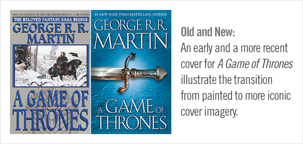
Although the online bookstore may not drive design concepts, there is evidence that selling online has influenced some overall trends. According to Matt Schwartz, VP of digital strategy and business development at RH, “In general, covers have become less busy and the prevalence of landscape and painted imagery has given way to more iconic and photographic covers.” Crisper imagery and simpler covers render well online, which suggests that designers do think about digital representation in early stages of design.

It is impossible to say with certainty whether these trends reflect a developing marketplace or simply readers’ changing tastes. When viewed through the prism of eOriginal cover design, however, the trends may take on more meaning. Lynn Andreozzi, Random House art director, who designs covers for the eBook-only imprints Hydra, Alibi, Flirt, and Loveswept, says that eOriginal covers “usually have one, fairly simple image with large type announcing the title and author name, but rarely include quotations or other busy elements like you would find on a print book.” These simpler, more straightforward covers enable the reader to quickly glean important information from a remarkably small image.
The online marketplace continues to be in flux and trends may change further. But for the time being, as Peter Mendelsund notes, “We designers always strive to find the best solution within the parameters we are given.”
Emily Condlin works in the Legal Department and on cross-departmental corporate projects at Penguin Random House

