Lately it seems that we spend a lot of time talking about social media, and much less time on email. But with the rise of smartphones and tablets, email is more accessible than ever before. Is email still a worthwhile tool for communicating with readers? If so, how do we get the most out of it?
You’re Still the One
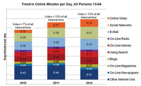
Despite the increasing amount of time spent on social media, email is still relevant and popular. 91 percent of active* U.S. Internet users use email at least once daily. Another study noted that the amount of time spent daily on email actually increased between 2010 and 2012, from 26 to 33 minutes. Usage of both email and social media has increased at the expense of other types of Internet activity and non-Internet activities (such as watching television).
Source: IAB/ Gfk April 2013. From Gfk’s Multimedia Mentor, Base: Adults 13-64 (5,000 per wave). See study here.
Smartphones and tablets are now hugely popular; around half of all people in the U.S. use smartphones and a third of U.S. adults have a tablet. For people who have smartphones, email is the most frequent activity, beating browsing the web and using Facebook. This study suggests that for tablet users, web browsing is more popular than email—but not by much (88 percent to 84 percent).
All this mobile connectedness means that very soon more people will open email on mobile devices than on their desktops. The trend toward mobile opening is particularly strong on the East Coast and in Texas, and for emails sent on the weekend.
What Does This Mean for Authors Sending Email?
The proliferation of different email-reading devices with different screen sizes makes it more difficult to create a single email that will look good to everyone. In the past, email services have focused on the desktop user experience, often automatically sending a separate text-based version for mobile readers. But with the growth in mobile email, it’s a better idea to design around the experience of the mobile user, as those emails will still look good on a desktop.
These are things you can do to make your emails more mobile-friendly:
- Use larger fonts (at least 14 or 16 points for copy and 20 points for headers)
- Make sure there isn’t too much copy inside the email itself
- Use big buttons rather than text links
- Try to ensure users don’t need to scroll to see your whole email
- Many people recommend a single-column design (although this MailChimp study says in some cases two-column can work better)
- Just in case, put key information in the top left part of the email (as some email browsers will show only this portion of the email)
- Check that your images come through properly on mobile devices
Low cost email providers like MailChimp, Constant Contact, and Campaign Monitor offer some mobile-friendly templates. If you have a developer who has designed an email template for you, she may enjoy this helpful article on designing email for an improved mobile experience. Some sophisticated email templates contain responsive design coding, which means that the email layout will change according to the browser size of the device it is being viewed on. However, this is more complicated than most authors will need. Remember to make sure that any web pages that you link to in your email are also mobile-friendly (see this previous article for more thoughts on this).
Because people are now using a wider range of email client software to read their emails, it becomes more difficult to feel confident that everyone will see a good-looking version of your email. The most common client software is Apple’s iPhone (24 percent), followed by Outlook (17 percent). We recommend that you take advantage of any previewing options offered by your email service provider (such as this one from MailChimp). More sophisticated previewing services are available (such as Litmus and Email on Acid) but they tend to be expensive.
For a basic introduction to email, check out our previous article.
* People who have used at least two technology-based platforms (including email, text, and social media) to connect with others during a given week.
Sophie McNeill is part of the Digital Marketing and Channel Development team.


